

Share this
by Cliff Rose
If you’re a PowerSignals® user, you might have noticed that the product looked a bit different when you logged in. The legacy landing page has been replaced with a new homepage featuring ISO market and Live Power® data. The new homepage enables users, with little setup or hunting down of market data, to quickly understand grid conditions at a high level, and then easily drill into other PowerSignals modules for further analysis.
How to Leverage the New PowerSignals Homepage
1. Intuitively Understand the Supply Stack Using Live Power Data
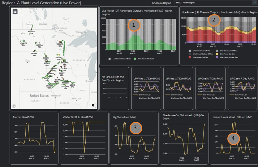
One of the cooler features of the new homepage is that it integrates Live Power data alongside ISO data to help users better understand the supply side of the market. Users can see current plant and line level capacity factors, view the renewable and thermal fleet output versus MWs monitored at both the ISO and regional levels, analyze how this plant output deviates from recent conditions, and understand the movement of key market moving plants, all in one view.
For example, in the below view of just MISO north, you can quickly see that in the early morning of August 26, wind picked up significantly across the region (1), coal generation in the region dropped off in response (2), and you can see these trends reflected at the plant level with Walter Scott Jr., Big Stone, and Shelburne coal plants dropping off (3), and Beaver Creek wind picking up that same morning (4).
2. Understand Grid Conditions at a Glance
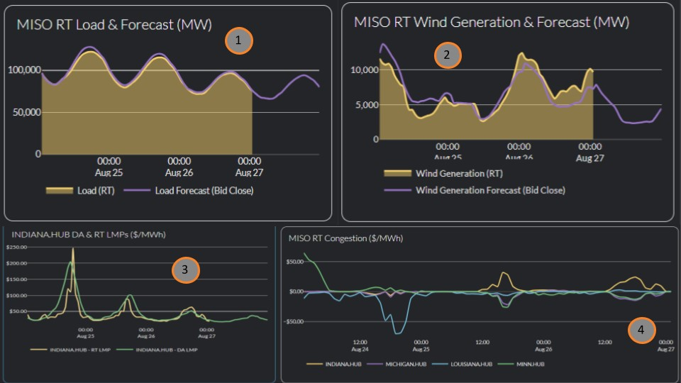
The new homepage also makes it easy to understand market dynamics at a glance. For example, using the below view, you can quickly understand that in MISO on August 24, load was high (1), and wind was low (2), resulting in high net load and high day-ahead (DA) and real-time (RT) prices (3). However, as wind picked up on August 25 and 26 and load dropped off, prices decreased. You can also quickly view zonal congestion with Louisiana hub experiencing negative congestion August 24, and Indiana Hub experiencing positive congestion while north MISO (Michigan and Minnesota) experienced negative congestion over August 25 and 26 (4).
3. Easy Drilling for a Deeper Analysis
The above is a very quick surface-level analysis of market dynamics over the past few days in MISO. But the new homepage enables easy drilling to our full suite of PowerSignals modules for further analysis. For example, if you want to do a deeper dive on load, simply click the load chart once, and drill into the load analysis module for a deeper dive.
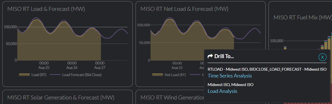
Similarly, if you want to know more about congestion described above, click the congestion chart, and it will take you right to the full suite of congestion tools with the data you need to analyze pre-loaded.
Conclusion
The new homepage was designed to highlight the key data points that are driving power markets, helping you understand market conditions right as you’re logging into PowerSignals. Powered by the most comprehensive power market data available, the new homepage enables you to drill down from any chart for more in-depth market analysis, providing immediate market insights and detailed market analysis, all in one tool.
Interested in a demo of Live Power data? Request a demo, and one of our industry experts will be in touch.
Yes Energy’s team of industry experts is dedicated to the delivery of comprehensive power market data with purpose-built tools, enabling market participants to understand market patterns and develop the best strategy.
Learn more about how Yes Energy helps customers Win the Day Ahead™ with Better Data, Better Delivery, and Better Direction.
