


Share this
by Yes Energy
Take your congestion analysis to the next level with Live Power, which focuses on power plants that affect markets.
Its 60-second updates give you far more data to understand congestion to ensure you’re making decisions on the best information. It’s not just for bal-day traders – Live Power is applicable for next-day and term traders because before you start forecasting you need as complete a picture as you can get on past and current happenings.
How to Use Live Power to Understand Real-Time Congestion
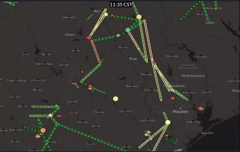
Current congestion and flow
The shape indicates fuel type and the color represents the capacity factor (what percentage of a plant’s current capacity is being produced). A green facility is producing at a high level, and a red facility is producing at a low level or offline entirely. The white arrows indicate the directionality of the flow, further helping you understand congestion patterns in an area.
This shows you which plants are online or offline and which plants can ramp up further, which is helpful for understanding congestion analysis.
It's also helpful to view the Live Power data alongside the locational marginal price (LMP) information and constraint shadow price information in our real-time price map tools.
Looking at the same screenshot but layering in the real-time LMPs, represented by each of those settlement points in yellow as well as the constraint information indicated by yellow circles in the Houston area.
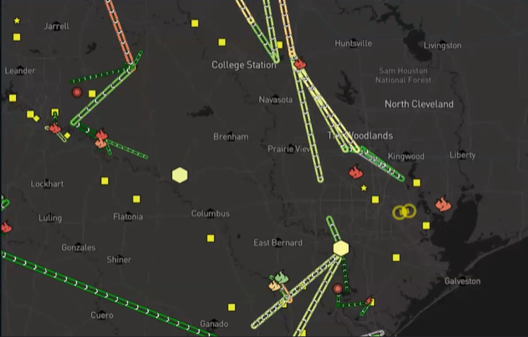
Having visibility into all of these things at once allows you to quickly identify which plants are likely contributing to congestion. In this case, two gas-fired facilities as well as a coal-fired facility southwest of Houston are worthy of additional investigation based on their proximity to the congestion.
You might also look for areas of the grid where generators are running at low levels, even though their LMP pricing is elevated, or areas where generators are running at a high level, even though LMP prices are depressed. That can indicate behavior by those generators that is contributing to congestion rather than relieving congestion and may even indicate a generator that's on outage.
All of this real-time generation information is helpful for understanding congestion, but when you're looking to make lots of decisions under serious time pressure, you want to be able to add context to those numbers quickly. And that's where Live Power’s precalculated delta views come in.
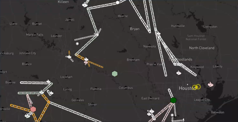
Instead of looking at just the current capacity factors, you can look at precalculated 24-hour, one-hour, and 60-second deltas, comparing the output and transmission levels right now to each of those previous periods.
All of the icons in green indicate plants that are running at a higher level relative to the comparison period 24 hours ago. All of the plants in red indicate plants that are running at a lower level relative to 24 hours ago.
Now we're getting additional information that wasn't immediately visible from just looking at the capacity factors, which is that that coal plant southwest of Houston is not only running at a high level, but it's running at a higher level than 24 hours ago, which may indicate a potential driver of congestion or other price volatility.
How to Use Live Power to Understand Historical Congestion
Live Power data can help you understand congestion happening in real time, but sometimes you want to understand congestion from last week, month, or year. That's where our analytics price map comes in.
Our analytics price maps allows you to replay market conditions including price information, constraint information, and transmission outage information from any point in time, you can look at a single day, a single week, or even look interval by interval or hour by hour and replay how conditions change across the day.
In this screenshot from August 10, we can see the currently active constraints near the Victoria, Texas, area along with the average levels of output at each of the live power facilities at that same point in time.
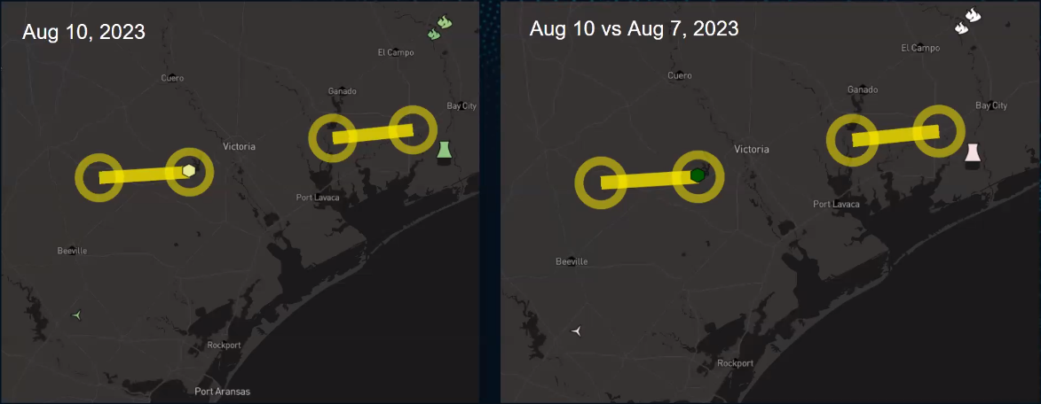
The analytics price map tool allows you to compare any two points in time. You can look interval by interval, or for the purposes of this example, you can compare what was going on on a high-congestion day to a low-congestion day.
The above screenshot on the right-hand side compares August 10 and August 7. We still see those constraints indicating that congestion was stronger on August 10 compared to August 7, but now we can see that output at the Coleto Creek plant was much higher on August 10 versus August 7, pointing to a potential driver for congestion.
This view helps you identify instances where a generator has gone on or returned from outage, causing or alleviating congestion.
The real-time and analytics price maps can help us visualize generation alongside congestion to help draw some connections. It can also help to visualize those relationships over time, and that's where the nodal profile tool comes in.
How to Use the Nodal Profile Tool
In our nodal profile tool, you have the ability to visualize day-ahead or real-time prices or even the DART (day-ahead, real-time) spread between those two markets.
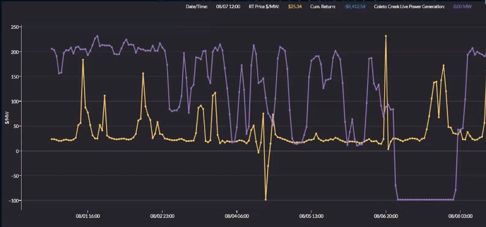
In yellow are the real-time prices at a specific price node, organized chronologically. In purple is the output at the Coleto Creek power plant.
You can also overlay the Live Power data onto that price data. In this case, we've chosen the Coleto Creek generator from the previous screenshot, and there was an outage at the Coleto Creek plant around August 7.
That outage period corresponded with increased positive locational marginal prices (LMPs) as well as an absence of any negative LMPs, which we saw earlier in the week.
How to Analyze Congestion at the Constraint Level
The screenshot below is from our constraint summary tools where we collect all of the ISO data about constraints and their shadow prices. You can see a listing of all of the constraints active over a period, plus the zone those constraints are located in, how many hours this constraint was active, the total amount of congestion on this constraint, the average amount of constraint per hour, and the maximum shadow price over the period.
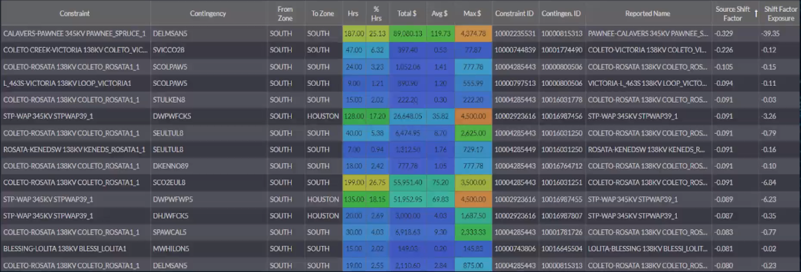
Thanks to the Live Power team’s mapping of all of the Live Power facilities to their respective price nodes and in the constraint summary tool, you can input that price node and calculate the shift factors for that Live Power facility on every constraint that was active.
How to Analyze Shift Factors
If you're really looking to hone in on the most significant constraints, we also combine that shift factor information with what we call our shift factor exposure column, which multiplies the source shift factor times the average shadow price. In some cases, you may have constraints where there's a large theoretical shift factor for a Live Power facility on congestion but in actuality we didn't see that much congestion.
By multiplying the shift factor times the average shadow price, you can pinpoint the most important constraints that have leverage on this Live Power facility. In the screenshot below, we can see the Calavers-Pawnee constraint had a large shift factor exposure on the facility that we're looking at.
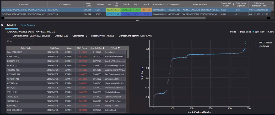
On the right hand side, you can see that we have shift factors displayed as a distribution chart. Often, you want to understand if a constraint has one or two nodes with large shift factors and the ability to exacerbate or relieve congestion or if it's a constraint where you have a lot of nodes with shift factors but they're all relatively small. Each of these dots in the distribution chart represents a node with shift factors on this constraint and are associated with Live Power facilities, so these are facilities that may be exacerbating or relieving congestion based on their relative levels of output.
On the left hand side, we have the exact same information presented in a table view, and the benefit is you can filter by things like the zone and shift factor. This is a powerful tool for your analysis because it quickly identifies which plants are worthy of further investigation and which aren't relevant to this congestion event.
What Else Can You Do with Live Power Data?
This data is most valuable when you can consume it programmatically and integrate it into your internal processes and tools. That’s why all of the Live Power data we've looked at is also available via our our data solutions, including the API and the cloud.
It's very easy to pull Live Power data programmatically and ingest it into your internal system.
Plus, with our DataSignals Cloud solution hosted on Snowflake, you can unlock even more potential uses for the Live Power data. You can do on-demand, market-wide scans of generation output across multiple ISOs without worrying about overloading a user interface or our API. Going back to the shift factor analysis, you could even combine the Live Power data with the shift factor information in our DataSignals Cloud solution to calculate constraint flow or leverage overtime showing exactly how much each Live Power facility was contributing to or relieving congestion on any constraint across a market.
Conclusion
Having data from Live Power every 60 seconds can help you hone in on the matchup between specific levels of generation and congestion. Its integrations across Yes Energy solutions can boost your congestion analysis, whether you're trading bal-day, next-day or term products.
The next step is bridging the gap between what has happened historically and what you expect to happen tomorrow or next week.
If you're interested in learning more about how Live Power can help you improve your generation and price forecasting, request a demo.