


Share this
by Gaby Flores
Exploratory data analysis (EDA) is an approach to data analysis that can help shed more light on your data set before moving onto the rest of your data science project. Adding EDA to your process can make your analysis easier and more precise and can suggest new hypotheses to test. EDA can take many forms, but it often includes analysis around datatypes, statistical summaries, histograms, correlation plots, and missing data analysis.
Yes Energy data scientists using Python are using pandas to perform EDA. Pandas is a package that allows you to create dataframes and perform analysis. It provides great information by running functions like describe, info, corr, and isnull within the pandas package to start your EDA. Using pandas, you can also leverage histograms and other charts to visualize the data relationships and distribution as part of your EDA.
We’ve taken things even further with our EDA by starting to rely on pandas_profiling for our basic EDA. Pandas_profiling returns a report with everything mentioned above – and more!
An Example
Look at an EDA example using panda_profiling on PJM DART spreads, wind generation, and load.
Start your analysis with a simple installation of the library:
pip install pandas-profiling
Once installed, you can run a profile against any dataframe. Here’s an example of the report returned based on our dataset – we've named this dataframe “data” – that we’re preparing for some machine learning.
pandas_profiling.ProfileReport(data)
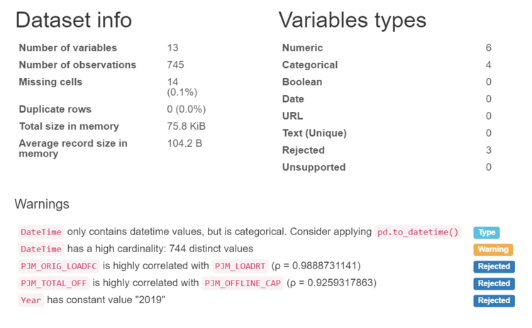
In the first section of the report we can learn about the size of our data. It's helpful to identify the severity of missing data within the dataframe. We also have a summary of the variable types. The warnings section is useful to identify data concerns and potential areas where you might want to do additional processing and engineering. This can include constants, potential date type transformations needed and identification of highly correlated variables.
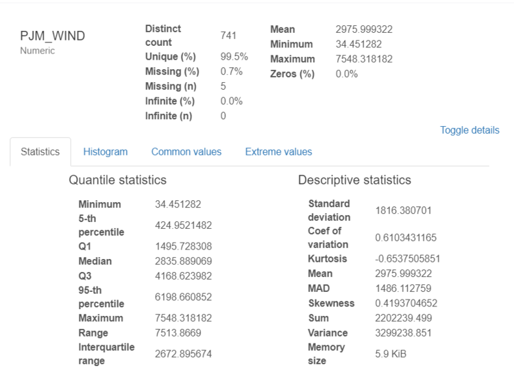
The next section of the report includes valuable statistical reports on each variable. The example above includes statistics on wind data. It allows us to understand not only the mean, min, and max but also the skewness of the data and shape via histograms.
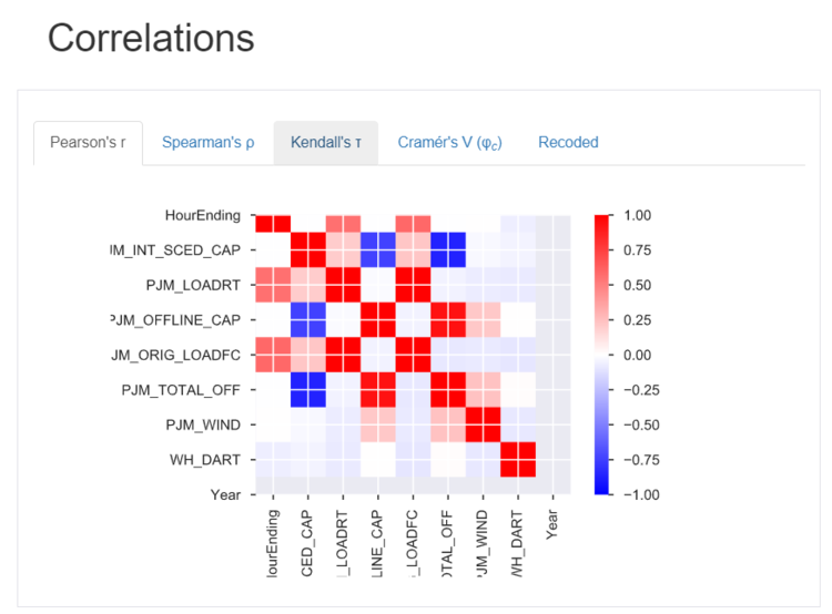
The next section will include correlations on the various items in the dataframe. Here we can see correlations between schedules and actual data. We can also see relationships between wind and capacity as well as offline capacity and scheduled capacity.
The other sections of the profile report include deeper analysis around missing data and snapshots of the first and last rows.
Once you’ve run a profile of the data, it’s much easier to identify where you might need to review inputs to improve your models.
More Examples
With over 1,400 datatypes in DataSignals, the use cases of the type of EDA are truly endless. But here are a few examples of other data science projects that you could apply panda_profiling to:
-
Reviewing data drivers associated with DART Spreads
-
Analyzing indicators of real-time pricing events
-
Identifying variables that result in stronger constraint binding intervals
-
Any data prep for an econometric model
If you want to see an example of pandas_profiling in action, let us know. We’re happy to share more examples of this using our DataSignals API!
